Tuesday, January 28, 2014

DESIGN | need to powder your nose?

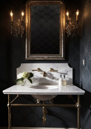
Powder bathrooms are the perfect room to push the envelope. There is no better place to express your personality. Stunning wallpaper or jaw dropping tile, amazing lighting, an eye-catching mirror, and an expected sink, that's the recipe for a great powder bathroom. Here are a few of my faves… 


black walls and a white marble sink, bold but classic


loving these library sconces in the bathroom 


everything can simple when the tile is this amazing


wow!


go glam with gold and black 


i want this sink.


did a double take when i saw this one. simple in some ways, crazy in others 


contemporary tile and antique pedestal? quite the mix 


wallpaper | the bolder the pattern, the better


Loving these metallic Weitzner wallcoverings:


Can't get enough of Osborne and Little's fun patterns:


Visual Comfort never lets me down. Check out these stunning sconces:


Currey and Co. is another favorite. Unique, show-stoppers:


- Sarah T. 


Tuesday, January 21, 2014

DESIGN | first impressions


There is an art to arriving. The first room in your home guests see is your entryway. With eye-catching patterns, ambient lighting, interesting architectural elements, fresh flowers, and personal touches, you can create a warm welcome. Here are some of my favorite foyers...

Wanting this wallpaper. Somehow it's bold, but not in your face. 


The beautiful arch, black tiled floor, and crisp white walls, what more could you ask for? 


Simple but not stark. Warm and welcoming.  


Loving the diamond patterned door.  


Mirrored ceiling, dark walls, amazing hardware, great art - Kelly Wearstler is flawless. 


What more do you need to know about this house? The entry says it all. One word: cozy. 
And can you believe that jadeite door? Amazing. 


Grand by not showy. Amazing paneling, beautiful lantern, something interesting at every corner, but not cluttered. Side note: plants indoors add life to any space. 


BOLD. My curiosity is peaked and I want to know what's around the corner. 


Just because you don't have a lot of space doesn't mean you can't do something special. Random thought - it never hurts to have extra chairs around. Best place to have them, flanking a great console. 


Can't get over these curves. Three elements that never fail in an entry: flowers, ambient lighting (sconces, lamps), and a mirror. Who doesn't need to check their hair before they walk out the door? 


A statement pendant, antique rug, French providential-esque console, and a distressed brass mirror. 
We mixed a lot, but we love how this entry turned out. 

Friday, January 17, 2014

PANTONE COLOR OF 2014 | radiant orchid


We are loving the Pantone Color of the Year 2014, Radiant Orchid.
 Incorporate this color into your home through accent pieces and accessories. 
It creates just the right pop, especially if paired with neutrals.


get these radiant orchid beauties from J.McIntyre HOME 
contact beth@jessicamcintyreinteriors.com for more info
1. glass satellite chandelier - $2,248 | 2. kids transparent chair - $135 | 3. throw pillows- 22 x 22 down filled dot- $185 , 20 x 20 down filled Moroccan pattern - $63 | 4. chevron patterned pouf - $248 | 5. shagreen small tray - $45 | 6. set of 25 clam shells - $57 


Until next week, 
Mallory


Wednesday, January 15, 2014

INVENTORY UPDATE | new year, new accessories

New great accessories at J.McIntyre HOME for the New Year.
Stop by Monday through Friday from 9am to 5pm to see all the new inventory.
 Happy 2014!

crystal obelisks | sm $80, med $100, lg $112

ikat tissue box | $60

ikat waste bin | $100

glass paper weight | $36

white planter | $168

peacock planter | $168

mandarin planter | $168

 small turtle shell on crystal | sm $65, lg $68 

Tuesday, January 14, 2014

INSPIRED | i met a celebrity

Have you ever been star struck by a celebrity? Most have, probably by a human celebrity. I was star struck over New Year's when I went to Frank Lloyd Wright's home, studio, and architectural campus, Taliesin West, in Scottsdale, Arizona. For those of you who might not be as enamored by the architectural greats as I am, let me give you a brief run down on this innovative genius. 

Frank Lloyd Wright (1867-1959) was an American interior designer, writer, educator, author, furniture designer, and architect. Wright was an apprentice under Louis Sullivan at Adler & Sullivan, where he had a hands-on education. Because of his experiences at Adler & Sullivan, he believed in learning by doing and did not allow apprentices at Taliesin to have a formal college education. 

Wright and his family would spend their summers at Taliesin in Wisconsin, and would winter at Taliesin West in Scottsdale. He was inspired by the desert landscape and beautiful light, which played a huge role in his designs. Many of the structures at Taliesin West have canvas roofs to let light filter through. Wright preferred to work under natural light. The rooms are built into the hills, and vertical openings shoot out of the ground so horizontal light pours through the spaces.

Wright loved the theater and movies. He played with different angles in one of his movie theaters to create the perfect viewing and acoustic experience for guests such as Marilyn Monroe and Frank Sinatra. He created the "Prairie Style" home. Wright was greatly influenced by his travels to Japan. A large percentage of Wright's income came from dealing art. 

Frank Lloyd Wright was an opinionated, headstrong creator who studied nature to understand how to design spaces. Visiting Taliesin West challenges me to consider the effects of light, nature, branding, art, spatial layout, and human interaction. He mastered them all. 

A few of his most well known works: Fallingwater, Usonian homes, Guggenheim Museum.

Here are some of the pics I snapped:


 If you're not completely bored, and want to read more, check out the Taliesin website.


Related Posts with Thumbnails